GeorgieVerity
Thursday, 7 June 2012
Tuesday, 15 May 2012
Matty Bovan Shoot
During the easter break i had the chance to help out with one of my friends lookbooks.
He is a fashion student at saint martins and has taken a gap year to gain experience and has done internships in paris and new york. He has worked for the likes of Diane Von Furtsenberg and John Galliano and he has also been noticed and complemented on his unique quirky style and products by vivienne westwood herself.
I was asked to model the garments for his new collections lookbook.
I thoroughly enjoyed the day and the experience has had me thinking about final major project work.
Here are a couple of shots i took, a sneak peak til the actual photos are available.
Labels:
accesories,
alternative,
art,
beautiful,
buisness,
contemporary,
contemporary fashion,
diane von furtsenberg,
fashion,
fashion.,
futuristic,
john galliano,
model,
Paris,
unique,
vivienne westwood,
woman,
women
Tuesday, 24 April 2012
Menswear Design Work
21ST Century Romance A/W 2013 Menswear
These are just a few shots of my initial design work.Using wadding to create a 3D ribcage effect on a vest/jumper. This was done half scale just to get an idea of how it would work out, i think the sample is very effective and would love to try this out full scale.
finished piece with the wadding sew in place
ideas for illustration, using print, ink, and layering.
Colour and illustration layout idea.
Design page, experimenting with fabric and padded skeleton approach.
Mens shirt looking into print and cuff detail.
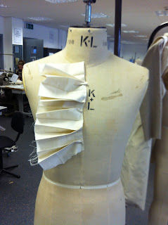
Pleating manipulation.
Mens Shirt ideas, looking at shape and detail.
Vest Prototype - Half Scale.
Illustration Idea.
21st Century Romance Menswear!
Group Work.
Not my favourite but this time i was put into a group with people with very similar tastes as me.
Its not usually this that bugs me its the co operation with people and organisation, i usually end up having to organise the group, but this time it was much simpler as the organising was spread out amongst three of us.
This was the group moodboard. Included fabric swatches and texture ideas.
A shot from the group presentation and our display of boards, these included an illustration including a full outfit and our range plan.
We also used objects to portray the mood of our theme, these were fur a rose and an encrusted skull.
We used black finger knitting to suspend out boards from the ceiling.
Wednesday, 21 March 2012
Enterprise Phone Cases
Skull Stud Phone Case!
One of the first designs by Salt & Pepper
Available to buy £15
Studded Lace look Phone Case In Red!
£15
Studded Tan Phone Case Real Leather
£15
All available to buy, will be posting a link to the etsy website soon!!
Labels:
accesories,
design,
goth,
gothic,
iphone,
phone covers,
studded,
studs,
technology
Pleat Manilpulation
These are a few pictures from my latest mesnwear collection, these are just images of experimentation with pleats as the collection is inspired by elizabethan collars, prints and colour.
This is something i enjoy doing as the littlest change can create a totally different look and can create a manipulated look to the figure.
Using pleats and sewing them into an unusual new piece, this would be effective on a mens shirt and would be interesting to use in a larger scale.
This is something i enjoy doing as the littlest change can create a totally different look and can create a manipulated look to the figure.
Using pleats and sewing them into an unusual new piece, this would be effective on a mens shirt and would be interesting to use in a larger scale.
Monday, 19 March 2012
Enterprise Prints. Ideas for Logo's
Currently in the process of an enterprise module, where we have to create a buisness this could involve selling products or us our selves being a product and offering out a service.
either way it is to gain experience in a buisness that we ourselves would run.
I have chosen to work with one of my fellow pupils someone i get along with very well.
Our initial thoughts for branding came from the idea of our friendship and our likes and dislikes.
Me and fiona (my buisness partner) get on very well but are almost complete opposites.
So by playing on this we thought of a couple of ideas for our brand name.
Ying & Yang
Sandpaper (The smooth and rough side)
Then we agreed on salt and pepper, the idea of black and white and how they go together.
We then looked into ideas for marketing and getting ourselves out there!
This is a picture from google that was used to create the salt and pepper design.
We wanted an old school feel to the logo, that kept the brand fun.
Salt & Pepper font idea , like old newspaper fonts.
We wanted our brand to be something that people would think about and want to look into as our products had nothing to do with food or salt and pepper it was just the 'idea'.
Finally our products will be phone and laptop covers, ranging in different sizes, and we will use our salt and pepper pot cards to leave in cafe's and bars to aim them at our desired customers.
This is how our idea links together.
We aim to be selling to busy, working, fashionable people.
Who love their statement peices.
I will post more information when the pieces are made and if you are interested will leave a link to buy the products.
Subscribe to:
Comments (Atom)


.JPG)
.JPG)


